

Avital
Responsive web design for a food experience company
The Challenge: Avital needs a better web-based experience to support its pivot to being a more corporate forward company. Since their current site was not designed with this in mind and it is their biggest area of growth, our challenge was to restructure the nature of the website in order to reach this new audience.
Overview
MY ROLE
User research, prototyping, wireframing, UI design, usability testing, information architecture
TECH
Figma, Miro, Sketch
TIMELINE
2-week sprint
TEAM
Sarah Ludlow, Paul Lyren, Katie Buenafe, Mallory Morgan
PROJECT SCOPE
Responsive web design

The Research
Research Goals & Methods
○ We conducted competitive analysis to identify trends among other food experience companies
○ We conducted 4 interviews and sent out a survey to better understand the behaviors surrounding how users book and plan team building events
○ We then conducted a series of usability tests on the existing site and our mid-fi and hi-fi prototypes to evaluate the viability of the information architecture
UX/UI Audit


Usability Test Results

Interview & Survey Results
Interview Findings
Survey Findings
Define
User Persona
In order to further solidify our research findings, we made a user persona which served as an anchor throughout the rest of the design process. Meet Katheryn Aquino:
User Journey
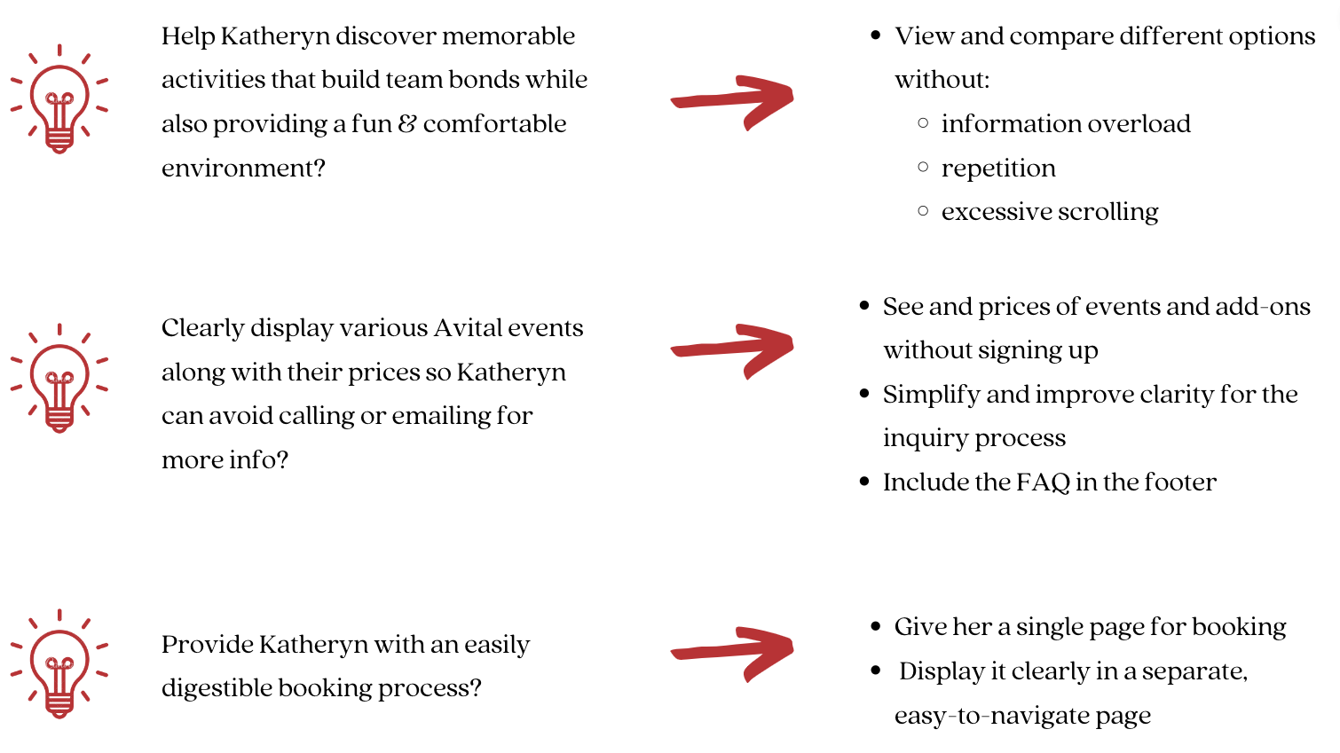
Problem Statement
Katheryn needs a way to discover and schedule virtual events due to her company's new hybrid work model to entertain clients, maintain strong group morale, and grow team bonds in a new and inclusive way.
How Might We…
Prototype Iterations
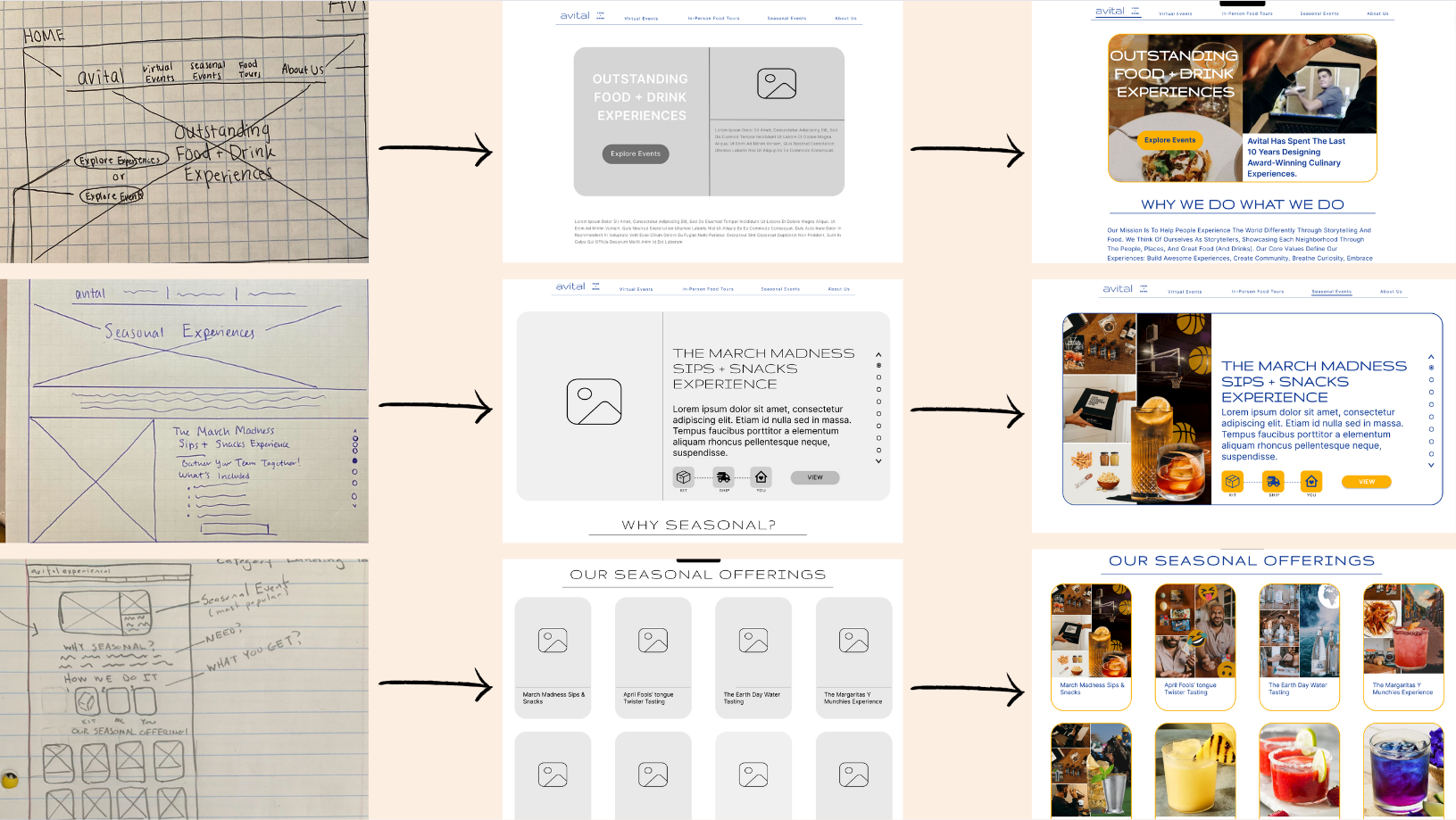
Main Takeaways

Develop
Hi-Fidelity Prototype
○ We introduced a new updated look for the website with rounded corners and a softer pallet on a white background which is much more on-trend and in line with competitors' websites
○ We chose the font Gruppo, for headlines that are rounded and much lighter and Inter for the body copy because it has a much cleaner feel and is easier to read at many different sizes. Both are sans serif and feel much more contemporary than the italicized and serifed font they currently have
○ The current site is over 7 years old and uses a dark grey background that feels dense. We kept two of their main palette colors to keep up their quirky aesthetic but added a bright blue and new grey for text